Spacing
Alignments
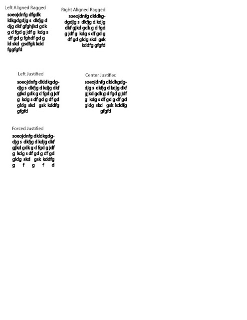
Right aligned
Left aligned
Justify - could be hard to read because of hyphens
H+J (hyphen rule: no more than 2 in a row, no more than 3 in a paragraph)
when you align on both side the type has to be stretched or squeezed and it can create rivers or valleys
wide colomns justified is fine - narrow choose left

Kerning (the adjusting of problem spacing between 2 letterforms)
generally the larger the type = you see some of the problems
typefaces that you buy usually have pair kerns: the designer will see that certain types of letters have problems and will build into the font pair kerns for that font, you have to turn auto-kerning on.
Nearest approach technique: you measure the distance of the closest parts of the letter and make sure it is the same. (mathmatically approach)
Optical Kerning/Alignment : sometimes it doesn't look spaced evenly, even though it is.
Two straights need more spaces
Curve and Straight are base space
Two curves need the least space
The reason for this is that your mind puts things into a box, but the O's actually go outside that box. You are adjusting the optical space of the perceived boxes.
Tracking
range of characters
Large Type: Track in
Small Type : Track out
(bad to better)
H e a d l i n e
H E A D L I N E
H E A D L I N E
H E A D L I N E
(don't track out a serif type face, especially not a lowercase serif face)
(if you are going to track out make it sans-serif and bold is better)
(best font to track out = bold condensed san-serif typeface)
Leading
Vertical : Linespacing
measured baseline to baseline
Set solid = no leading at all
120% of the font height
so...
a 10 point type will have 12 leading: 10/12
12/14.4
16/19.2
small type - add leading
for large type /display type - less leading
What is the point of paragraph spacing is to let you know that a new idea has started.
If you use both paragraph spacing and indent then it is like you are telling them twice.
Paragraph Spacing
Do not use MLA format
X - double return after paragraph (white line)
Double return - Upper limit
Amount of the leading - Lower limit
Indenting - first line indent
1 em (visually no more than the leading)
typewriters : 5 spaces
A tab by default is half an inch
Proper way - you do not need to indent on the first paragraph:
When you have a header it will look like crap confusion.
----
Get this book:
Robert Bringhurst - Elements of Typographic Style
-------


No comments:
Post a Comment