Important: Make sure you attend Week 4
Terminology - Definitions
Important Invisible Elements of Type:
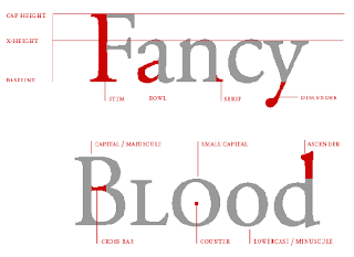
Baseline
X-height
Cap-height
Negative spaces
Leading, Tracking, etc

X-height:
Why the X - because it the the only letter that touches all 4 corners of the box.
The rounded letter forms like O will break out of the boxes.
(mentioned in class)
Serifs
Contrast
Counter
Bracketed Serifs
Unbracketed Serif
Bar
Stroke
Stress- the angle (between the thick and thin part)
can have vertical or nearly vertical stress
Stem
 |
| Types of Serifs |
---------------------
Type-Family - typefaces that share certain characteristics
>Typefaces>Fonts
>variants
Example: Typeface is Helvetica > Font: Helvetica 12 pt (the size or cut of that font)
Variants:
Roman
Italic
Oblique
Bold
Extra Bold / Heavy / Black
Light / Thin
Condensed
Expanded
Italic vs Oblique -
oblique is when it is leaned to the side
The characters in an oblique font are artificially slanted
italic The characters in an italic font are truly slanted and appear as they were designed.
4 Indicators for Type Family:
Serifsx-height
contrast
stress
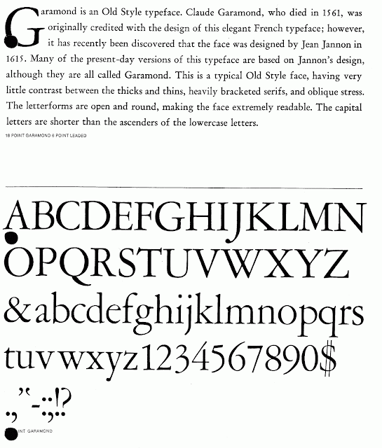
1. Old Style:
Associated with the Renaissance
GaramondJensen
Times
Gramond: this is great for readability
serifs - moderately bracketed
moderate x-height
moderate contrast
moderate stress

old style faces are designed for readability not really designed to be catchy (like for a logo)
2. Transitional:
Baroque/Classical (early America, late 18th century)
BaskervilleCaslon (Declaration of Independance)
Baskerville:
Heavier Contrast - big difference between thicks and thins
Heavier Brackets (more as opposed to the reading image below -liars)
Basically no Stress - almost vertical
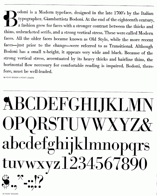
3. Modern:
(not modern to now, modern back then) Industrial Revolution
when machines started making machines - the rise of marketing and logos
Bodoni
Didot
Bodoni:
Serifs -unbracket (this era's style is kind of a detour) (intended to grab attention)
xheight- (sometime you see shorter xheight with modern, but not so much here)
extreme contrast
vertical stress
 harder to read
4. Egyptian:
19th Century Great Britain, pulling back/putting on the breaks from the direction that modern was going.
Century (named after the client not the creator)
Memphis
Clarendon
Palatino (could be contemporary but has slab serifs)
Century :
moderate xheight
moderate stress
moderate contrast
restrained version of a Slab-serif (squared off tip)
5. Contemporary
20th century phenomenon
Some guy who hates serif, kinda as a joke chops off the serifs. Not taken seriously at first.
Helvetica (super over used)Arial (cheap knockoff of Helvetica)
Optima - designed by Zapf (zapf re-released optima as Optima Nova with a true italic)
Futura
Bauhaus
Gill Sans
Universe
Helvetica:
no serifs
vertical stress
large xheight
contrast - slight to very little sometimes as the shoulder it gets a little thiner (no contrast = mono linear)
it is designed with a thiner shoulder because if you zoomed out it would look to thick and dark by making it thiner it still looks monolinear
Bauhaus school said you should get rid of any decorative elements.
(the text says this font is very readable but they are liars - it is not very readable)
-------------
Break
----------
6. Gothic / Blackletter
7. Script - Zapfino, Scriptina, Apple Chancery
8. Decorative
Look 3D, Victorian fonts harington. more recently it is a font with a pictographic element (like Curlz)
9. Picture (dingbat)
Any font with the word ding, bat, or ornament. Wingdings, Zapf Dingbats, Hoefler Text Ornaments
10. Monospaced
The letters are squished in to fit into the same single space. Courier, Monaco, (not american typewriter),
11. Handwritten
Intended to look hand written
12. Grunge (used to be called fringe)
Not so much about adding some as much as tearing it apart and smashing it, ripping it up.
Recently it's like a combo of Handwritten and Grunge, everything has a handwritten look these days.
Example:


No comments:
Post a Comment