Only use futura bold or century gothic bold.
---------
in Illustrator
types > glyphs - shows you all the available ligatures and other stuffs
for the hw.project you don't have to create outline the text in order to distort it.
booyah
homework:
Choose 2 words and pick two words of your own.
You don't have to print and mount it.
Word Project
Tuesday, November 30, 2010
Tuesday, November 23, 2010
Class notes
Title Sequence - film, tv, video game
-thumbnails (several different ideas, by hand)
-roughs (more sketches but work all the way through)
(15-20 frames)
- final digital (illustrator)
----------------------------
1. dimension - aspect ratio
4:3 (old television ratios)
16:9 - cinema proportions
1.33:1 (good for talking heads, good for when the shots is constantly moving)
1.78:1 (longer shot, lawrence of arabia like scenes)
Computers
640 x 480
800 x 600
1024 x 768 (average)
1600 x 1200 (metropolitan areas)
1920 x 1600
---------
2.Conversions
To make 4:3 fit into cinema:
Stretch:
4:3 image stretched to fill a
16:9 screen

http://www.crutchfield.com/S-0cqnSOWVTe4/learn/learningcenter/home/aspect_ratio.html
Letterbox: When you take large format and shrink it down to fit smaller.

Crop:
Pan and Scan : zooming in on particular images/shots
--------------
3. Safe Area
put them in the middle so they don't get chopped
basic rule of how long to leave the words on the screen - long enough so that you (the designer) can read through it 3 times over (this is about how long someone else who has never read the text before takes to read it for the first time)
----------------------
-----------------------
http://notcoming.com/
http://notcoming.com/saulbass/index2.php
-thumbnails (several different ideas, by hand)
-roughs (more sketches but work all the way through)
(15-20 frames)
- final digital (illustrator)
----------------------------
1. dimension - aspect ratio
4:3 (old television ratios)
16:9 - cinema proportions
1.33:1 (good for talking heads, good for when the shots is constantly moving)
1.78:1 (longer shot, lawrence of arabia like scenes)
Computers
640 x 480
800 x 600
1024 x 768 (average)
1600 x 1200 (metropolitan areas)
1920 x 1600
---------
2.Conversions
To make 4:3 fit into cinema:
 |
| 4:3 with pillars |
Stretch:
4:3 image stretched to fill a
16:9 screen
 |
4:3 image zoomed to fill a |
Letterbox: When you take large format and shrink it down to fit smaller.

Crop:
Pan and Scan : zooming in on particular images/shots
--------------
3. Safe Area
put them in the middle so they don't get chopped
basic rule of how long to leave the words on the screen - long enough so that you (the designer) can read through it 3 times over (this is about how long someone else who has never read the text before takes to read it for the first time)
----------------------
-----------------------
http://notcoming.com/
http://notcoming.com/saulbass/index2.php
Tuesday, November 16, 2010
Class Notes
Homework:
all homework and do overs are due week 8title sequence - expresses something about the film, type dominant
some good + some bad examples
Type Formatting for Public Consumption:
Single space between sentence.
Do not use a double return between paragraphs (do not format the double return so that it is just smaller).
For Typo Basics:
Correct Typos
Widows + Orphans (not really correctable for this project)
Punctuation
---------------------
Punctuation:
Quotations
curly quotes
true quotes
sixes and nines
‘—’
“—”
‘—’
“—”
‹—›
«—»
A quote inside of a quote alternate “ ‘—’ ”
" inches and minutes
' feet and hours
Where to put the period:
In America:
"This is a quote."
There was a guy who said " this quote."
(This is a sentence.)
This is a sentence (and this too).
Apostrophe:
’
They’re
rock ’n’ roll (not ‘n’)
o’clock
The dog’s fleas (possesive)
The dogs’ fleas (the fleas of the multiple dogs)
Louis’s class
Charles's ear
it's (it is, it has)
its (possessive pronoun)
hers (possessive pronoun)
theirs (possessive pronoun)
never use an apostrophe for a plural
NEVER : download mp3's
Dashes:
hyphen -
(a little below the x height)
uses:
used for hyphenating words that don't fit into that paragraph
compound words : non-designers
with non-lining numerals
 lining numerals (hyphens dont always work for this)
non-lining numerals (hyphens work well for this)
415-555-1234 (this hyphen does not work because it is too low)
I am butt ugly.
A butt-ugly person. (hyphenated because it is conveyed as a single unit/adjective)
em dash —
(designed long and thinner, at the x height)
(its the size of an em = the font size, the same size as the size of the type)
no spaces on either side, separates phrases
The tea—with cardamom and other spices—was delicious and fragrant.
en dash –
(half the size of the em dash)
(at the x height, not below)
use spaces between 1980-1990 (no spaces)
— alt 0151
– alt 0150
tilde, minus sign,
Ellipsis
(ellyptical writing , when you leave out words that are basically understood)
do not hit period three times
… alt0133
---------------------------------
Special Typ Char NoPW
Char Set Web 1
Char Set Web 2
Tuesday, November 9, 2010
Homework
day 6
reorganize the text
make thumbnails
of basica layout of the text
3 comps of 1 page (pick a longer page)
next week 1 comp of all pages
thumbnails - pencil paper
comps - computer
reorganize the text
make thumbnails
of basica layout of the text
3 comps of 1 page (pick a longer page)
next week 1 comp of all pages
thumbnails - pencil paper
comps - computer
Class Notes
Week 6 - Project 2 - Web Type Design
Week 7 - comps + text revision
Week 8 - project2 final
Week 9 - project 3 - film title sequence storyboards
Week 10 - Quiz 2 (web and video type , and a little from week 4)
Week 11 - presentations
-------------------------------------------------
Type for the Web
pixels: non absolute = ?
points: absolute = 72
(they have nothing to do with one another, because pixels are different on mac and pc)
96 pixels per inch according to web consortium
When designing type for the web you do not have pixel perfect control.
Legibility and Readability
Hierarchy
Accessibility
Sans-Serifs: Arial, Helvetica, Verdana
Geneva
Tahoma
Trebuchet
(New York) kinda
We are slowly switching from Client-side to Server-side.
Best for readability is moderate old style fonts, but now we have to deal with pixels.
You have to find the pixel version : an alias (a mask or approximation of the original design)
Anti-aliasing - uses a visual trick to smooth out the images. (masking the mask)
In Print :Times is better, in Web : Georgia is better.
In Print: Helvetica is mroe readable, in Web: Verdana.
No more than 1 sans-serif per page.
You can use 2 serifs.
Value Contrast is important for readability, but a little less critical for web.
This is because monitors can display more contrast than in print.
Apple uses grey on light grey.
Build your body copy based off your target audiance.
http://www.typechart.com/
http://www.typetester.org/
Lets you see different version of the same info/type.
-----------------
Writing for the Web
Audience -
1. because they have to
2. because they're professionally interested
3. because they're personally interested
scanable - the most important thing
most people never read all the content
you have to give them scannable chunks
try to lead the eye down to the content area
keep it short* although this is changing
give people sign post - if you have to scroll way down you have to give them visual cues so they can remember where the content they want is.
topical words- bold certain words to help people to scan
Pyramid Writing - you start out with the small stuff and you keep building up to the most important point
Journalistic Writing - editorial

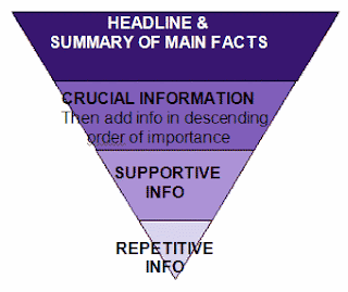 You should write like an inverted pyramid for every paragraph and the entire text.
Based on newspapers - above and below the fold (above the fold is the content you see before you have to scroll)
Most people in our area at the least:
1024x768 pixels
Most major sites are designed 950, 960, 970
Fixed Width: more control, does not fit all window sizes
Liquid Width: does fit all monitors, problem is lack of control and measure length
Wikipedia - liquid width layout
Week 7 - comps + text revision
Week 8 - project2 final
Week 9 - project 3 - film title sequence storyboards
Week 10 - Quiz 2 (web and video type , and a little from week 4)
Week 11 - presentations
-------------------------------------------------
Type for the Web
pixels: non absolute = ?
points: absolute = 72
(they have nothing to do with one another, because pixels are different on mac and pc)
96 pixels per inch according to web consortium
When designing type for the web you do not have pixel perfect control.
Legibility and Readability
Hierarchy
Accessibility
Web-safe fonts :
Serifs: Times, Times New Roman, Georgia, Sans-Serifs: Arial, Helvetica, Verdana
Geneva
Tahoma
Trebuchet
(New York) kinda
We are slowly switching from Client-side to Server-side.
Random Info:
If you just made image text for everything it would work with screen readers.
Free Screen Reader: http://firevox.clcworld.net/
Flash for iphone - SkyFire http://www.skyfire.com/Best for readability is moderate old style fonts, but now we have to deal with pixels.
You have to find the pixel version : an alias (a mask or approximation of the original design)
Anti-aliasing - uses a visual trick to smooth out the images. (masking the mask)
 |
| Anti-Aliased Text |
In Print :Times is better, in Web : Georgia is better.
In Print: Helvetica is mroe readable, in Web: Verdana.
No more than 1 sans-serif per page.
You can use 2 serifs.
Value Contrast is important for readability, but a little less critical for web.
This is because monitors can display more contrast than in print.
Apple uses grey on light grey.
Build your body copy based off your target audiance.
http://www.typechart.com/
http://www.typetester.org/
Lets you see different version of the same info/type.
-----------------
Writing for the Web
Audience -
1. because they have to
2. because they're professionally interested
3. because they're personally interested
scanable - the most important thing
most people never read all the content
you have to give them scannable chunks
try to lead the eye down to the content area
keep it short* although this is changing
give people sign post - if you have to scroll way down you have to give them visual cues so they can remember where the content they want is.
topical words- bold certain words to help people to scan
Pyramid Writing - you start out with the small stuff and you keep building up to the most important point
Journalistic Writing - editorial

Based on newspapers - above and below the fold (above the fold is the content you see before you have to scroll)
Most people in our area at the least:
1024x768 pixels
Most major sites are designed 950, 960, 970
Fixed Width: more control, does not fit all window sizes
Liquid Width: does fit all monitors, problem is lack of control and measure length
Wikipedia - liquid width layout
Subscribe to:
Posts (Atom)