Week 7 - comps + text revision
Week 8 - project2 final
Week 9 - project 3 - film title sequence storyboards
Week 10 - Quiz 2 (web and video type , and a little from week 4)
Week 11 - presentations
-------------------------------------------------
Type for the Web
pixels: non absolute = ?
points: absolute = 72
(they have nothing to do with one another, because pixels are different on mac and pc)
96 pixels per inch according to web consortium
When designing type for the web you do not have pixel perfect control.
Legibility and Readability
Hierarchy
Accessibility
Web-safe fonts :
Serifs: Times, Times New Roman, Georgia, Sans-Serifs: Arial, Helvetica, Verdana
Geneva
Tahoma
Trebuchet
(New York) kinda
We are slowly switching from Client-side to Server-side.
Random Info:
If you just made image text for everything it would work with screen readers.
Free Screen Reader: http://firevox.clcworld.net/
Flash for iphone - SkyFire http://www.skyfire.com/Best for readability is moderate old style fonts, but now we have to deal with pixels.
You have to find the pixel version : an alias (a mask or approximation of the original design)
Anti-aliasing - uses a visual trick to smooth out the images. (masking the mask)
 |
| Anti-Aliased Text |
In Print :Times is better, in Web : Georgia is better.
In Print: Helvetica is mroe readable, in Web: Verdana.
No more than 1 sans-serif per page.
You can use 2 serifs.
Value Contrast is important for readability, but a little less critical for web.
This is because monitors can display more contrast than in print.
Apple uses grey on light grey.
Build your body copy based off your target audiance.
http://www.typechart.com/
http://www.typetester.org/
Lets you see different version of the same info/type.
-----------------
Writing for the Web
Audience -
1. because they have to
2. because they're professionally interested
3. because they're personally interested
scanable - the most important thing
most people never read all the content
you have to give them scannable chunks
try to lead the eye down to the content area
keep it short* although this is changing
give people sign post - if you have to scroll way down you have to give them visual cues so they can remember where the content they want is.
topical words- bold certain words to help people to scan
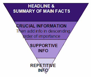
Pyramid Writing - you start out with the small stuff and you keep building up to the most important point
Journalistic Writing - editorial
You should write like an inverted pyramid for every paragraph and the entire text.
Based on newspapers - above and below the fold (above the fold is the content you see before you have to scroll)
Most people in our area at the least:
1024x768 pixels
Most major sites are designed 950, 960, 970
Fixed Width: more control, does not fit all window sizes
Liquid Width: does fit all monitors, problem is lack of control and measure length
Wikipedia - liquid width layout


No comments:
Post a Comment